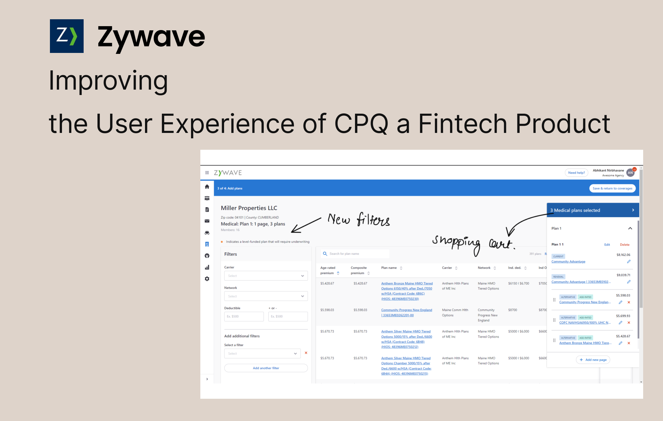
Project overview
The product
The platform had been in use for years, and it showed. Features had been added without a consistent design direction, workflows took too many steps, and users had learned to work around the system instead of with it. Brokers and ops staff were spending more time navigating than working their cases.
The challenge
Errors were common, onboarding took weeks, and support tickets kept piling up about things the interface should have made obvious. Experienced users had built so many workarounds, external spreadsheets, sticky notes, that the real inefficiency had become invisible. The product needed a rethink, not a visual refresh.
Map where users actually got stuck and why · reduce the steps to complete a standard quote · make patterns learned in one area carry to another · cut onboarding time · give visibility into quote status and pending actions · reduce navigation-related support volume.
My role
I was the only designer on this product. In our team, each designer owned one project end to end, so I was responsible for every part of the design process, while weekly design critiques kept the quality honest and the thinking sharp.
I worked directly with the product owner from day one, attending roadmap sessions and translating business requirements into design briefs the team could act on. Research ran the same way: I ran the interviews and contextual inquiry sessions myself, and brought findings back to critique for interrogation. And before any design happened, I got the product owner and sales team to agree on the metrics we'd be judged on, so the later calls came down to evidence instead of whose opinion was loudest.
Years of unguided features. Brokers navigated more than they quoted.
Years of feature additions with no consistent design language meant brokers spent more time navigating than quoting. Key details were buried in unexpected places, error states were confusing, and the interface punished new users hardest.
Information buried, clicks everywhere
Brokers hunted for basic quote information that should have been immediately visible. A standard quote took a minimum of 12 clicks.
Pricing errors at scale
Complex commission structures and unclear validation led to systematic mistakes, quietly eroding trust in every number the system produced.
No duplication, so spreadsheets
The system had no way to duplicate or version a quote, so brokers tracked variations in external spreadsheets instead.
A brutal learning curve
New brokers needed 2–3 weeks to get productive because the interface followed no predictable patterns, every screen its own little system.
Research first, with real users this time
Not every project gives you direct access to users. This one did, and I used it. Spending real time with brokers before touching the UI kept assumptions from driving the decisions. Several things we were sure were problems turned out not to be; the real blockers were hiding elsewhere.
We were wrong about where the time went
Going in, everyone was sure the slow step was the pricing screen, so that is what we planned to redesign. Contextual inquiry said otherwise: brokers had quietly built external spreadsheets to dodge a quote-duplication gap, and that workaround was the real cost, not the screen we had blamed. We dropped the pricing-screen plan and rebuilt around duplication and validation. The research paid for itself before a pixel moved.
The findings that set the agenda
of brokers used external spreadsheets to track quote variations, because the system had no duplication feature.
clicks minimum and 18 minutes on average to generate a single quote.
in quote pricing were a recurring complaint, traced to unclear commission logic and weak validation.
for a new broker to reach productivity, the cost of an interface with no shared patterns.
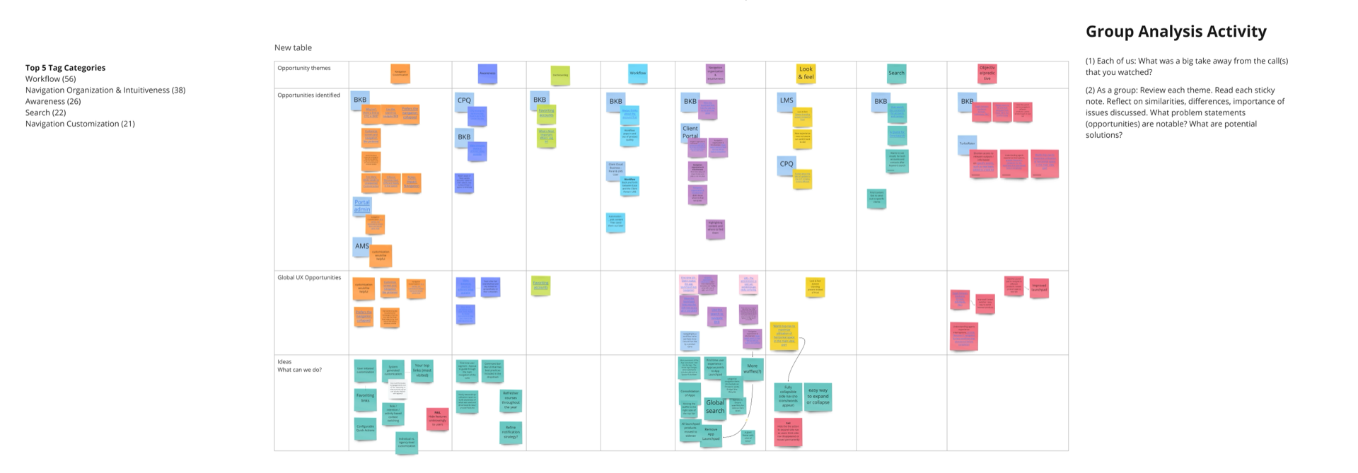
A design system that needed consistency
Before any screen design started, the product had a design system, but it was applied unevenly: colors hardcoded in places, components rebuilt independently on each screen, no shared language between design and engineering. I worked inside that system and extended it with reusable components, semantic color, spacing, and type scales, before redesigning a single workflow.
The investment paid off: consistency made patterns transferable for users, development moved faster against a shared vocabulary, and the system became the foundation engineering still builds on.
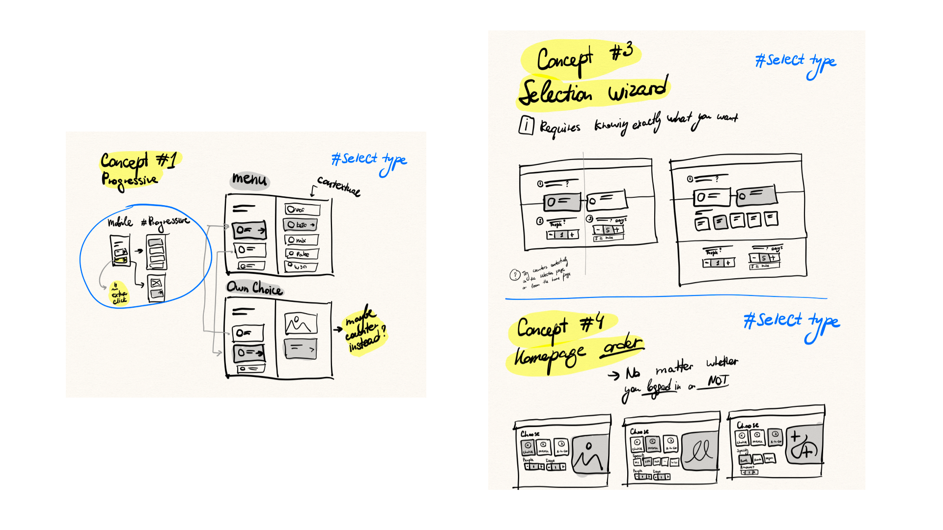
Cut complexity, surface the key details, keep workflows recognizable
The redesign focused on three things: cutting unnecessary complexity, surfacing the most important information without a click, and building a consistent experience new users could pick up quickly, while keeping core workflows recognizable for the long-time users who'd built habits around them.
Quote duplication: the #1 request, finally
Brokers can duplicate any quote and create variations in seconds, killing the spreadsheet workaround used by 82% of them.
Key information surfaced, not buried
Quote status, pending actions, and pricing details visible at a glance, the data brokers hunted for now leads the layout.
Validation that explains itself
Clear commission logic and inline validation attack the pricing errors at their source, instead of letting errors surface downstream.
Responsive, because deals happen everywhere
A fully responsive interface lets brokers review and modify quotes on tablets and mobile, not just at their desks.
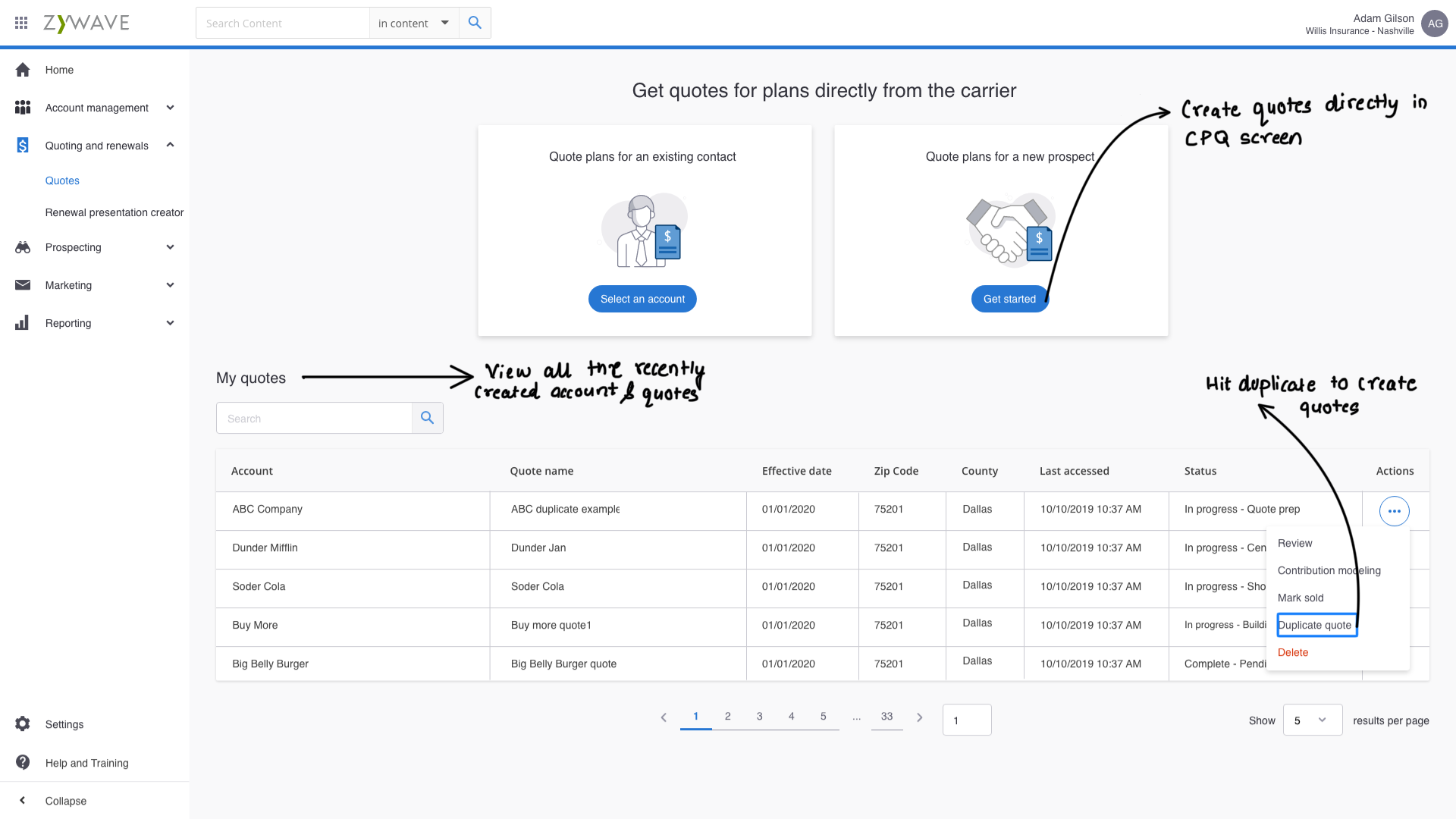
Quote duplication was the #1 request. Now it takes seconds.
"Finally! Quote duplication was our #1 request. Now I can create variations for clients in seconds instead of starting from scratch."
The best findings came from what we weren't looking for
Let research redirect you
Some of the most important findings came from things we weren't specifically looking for. Several assumed problems weren't problems at all.
Critique keeps quality honest
Bringing work-in-progress to the team weekly meant other designers caught what I was too close to see, and pushed the work further.
Define metrics before designing
Success criteria set up front kept the team focused on whether things were actually improving, not just whether the new design looked better.
Balance familiarity with improvement
Long-time users had habits. We kept core workflows recognizable while modernizing the patterns around them.
What I'd do differently
Involve engineering earlier. A few screens needed rework when technical constraints surfaced later than they should have. I adjusted the process mid-project to include engineering from the design phase.
Keep better decision logs. More thorough design documentation would have helped onboard future team members and made the reasoning behind choices easier to revisit.
Plan a phased rollout from the start. Launching everything at once was risky; a staged rollout would have let the team learn from real usage and iterate faster.