Project overview
The product
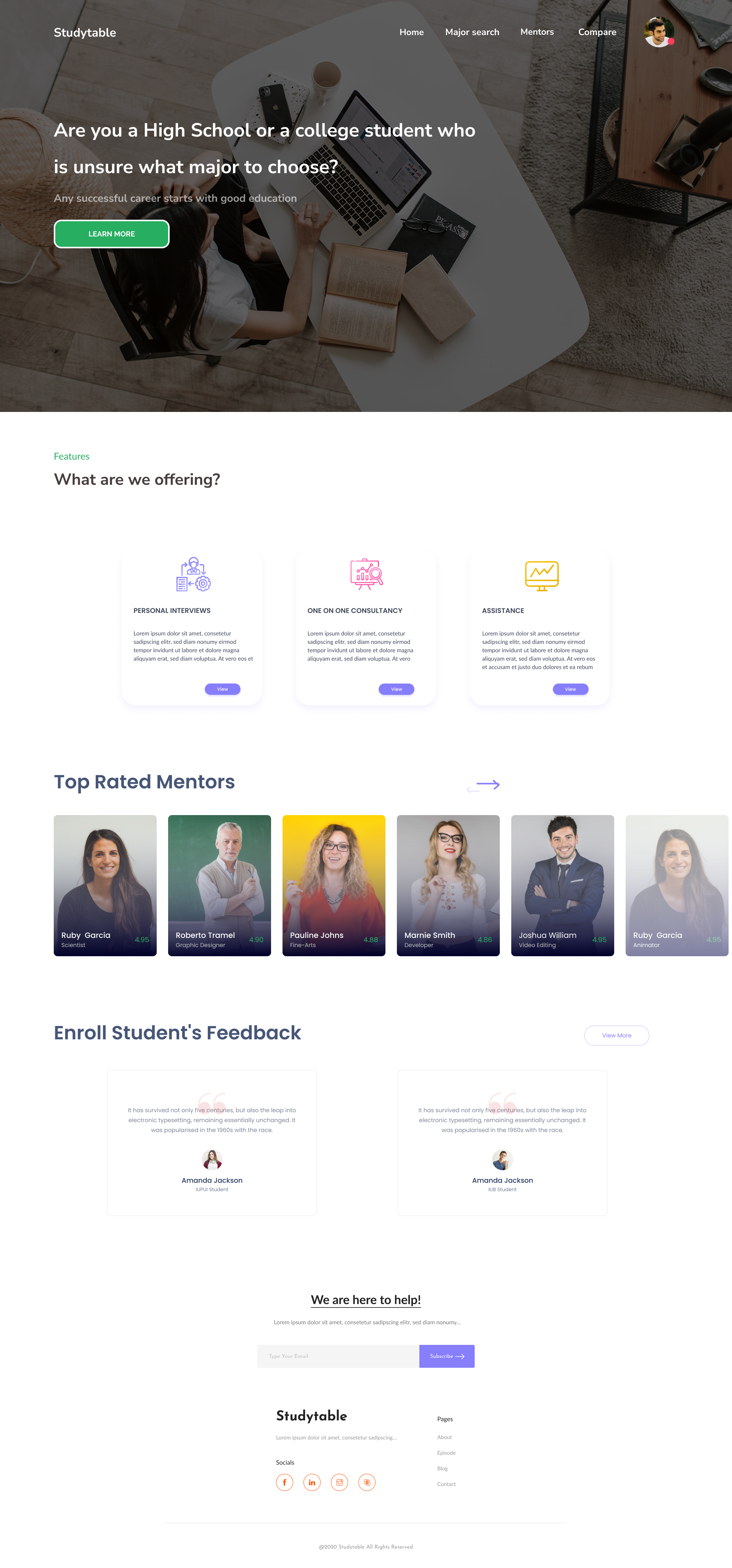
Studytable guides students to a major that fits. It looks at the courses and grades they already have, recommends majors, and lays out the parts of the decision that usually stay hidden: how hard the courses are, what careers and salaries follow, and what financial aid covers. When students want a human, it matches them with mentors for a call.
The mandate
As my IUPUI capstone, this was an end-to-end brief: take a real, costly student problem and carry it from research all the way to a working prototype. The decision to pick or switch a major has money and years attached to it, so the design had to be trustworthy, not just pretty.
Turn "I have no idea what to major in" into a confident, informed choice, by showing students the fit, the cost, and the time of each path before they commit.
My role
This was my capstone, so I owned all of it: the research, the information architecture, the two decision flows, the full screen design, and the clickable prototype that tied it together.
The real design work was structural. A major decision has three moving parts, fit, cost, and time, and most tools only show one. My job was to put all three in front of a student at the moment they actually decide.
The problem
Students choose one of the most expensive decisions of their lives, a major, with almost no usable information. They go on gut feel, then discover the cost, the difficulty, or the job market too late to change course cheaply.
No sense of fit
Students rarely connect the subjects they already do well in to the majors that would suit them. The signal is there in their grades; nothing reads it back to them.
Switching is expensive
Changing a major late can add semesters and fees. Students need to know what a switch actually costs in time and money before they make it.
Advice is scattered
Difficulty, salaries, financial aid, and real mentor experience live in different places. No single view helps a student weigh them together.
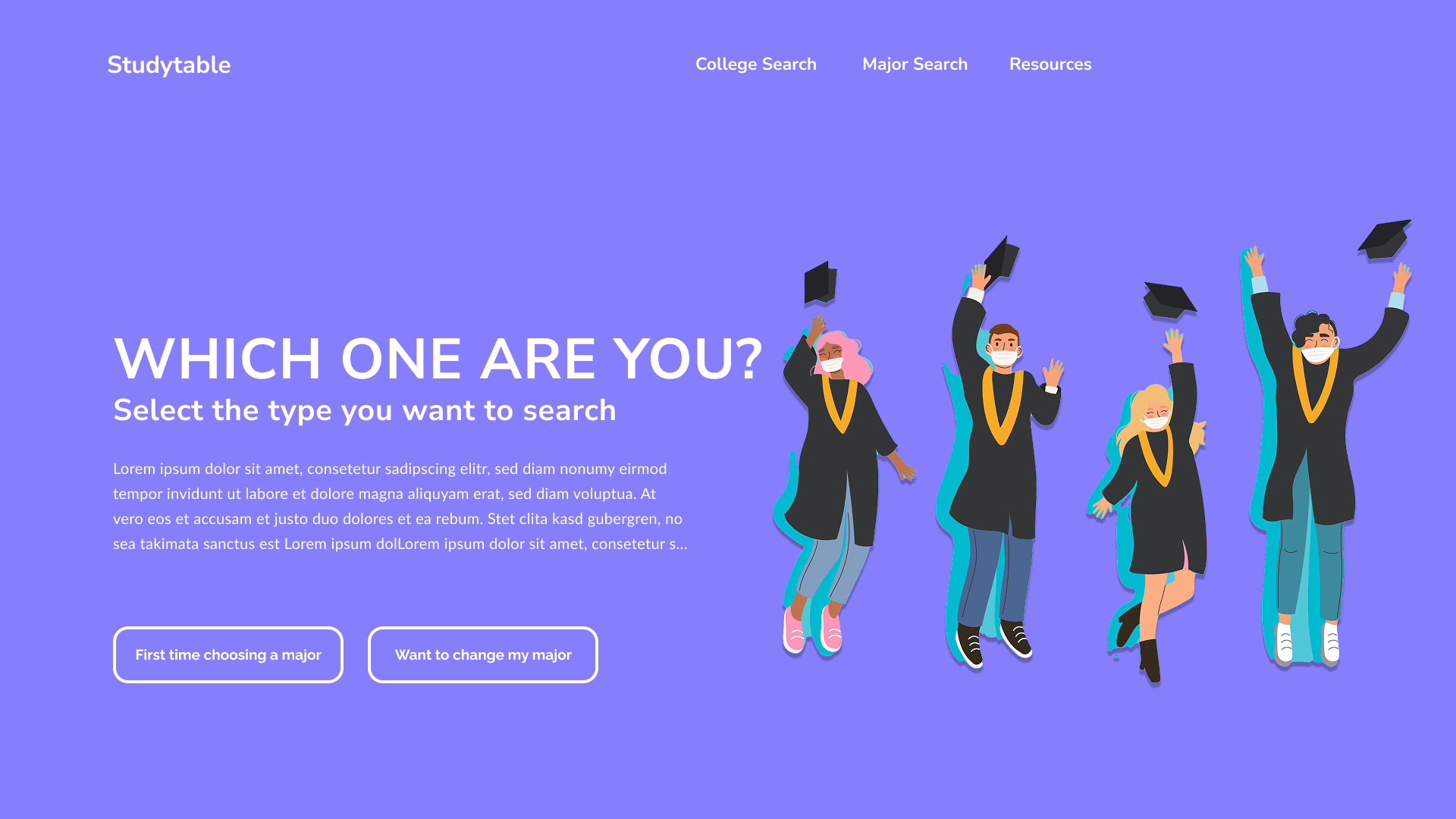
Two students, two paths
Research kept surfacing two very different students with the same anxiety. The whole experience starts by asking one question, "which one are you?", and branches from there.
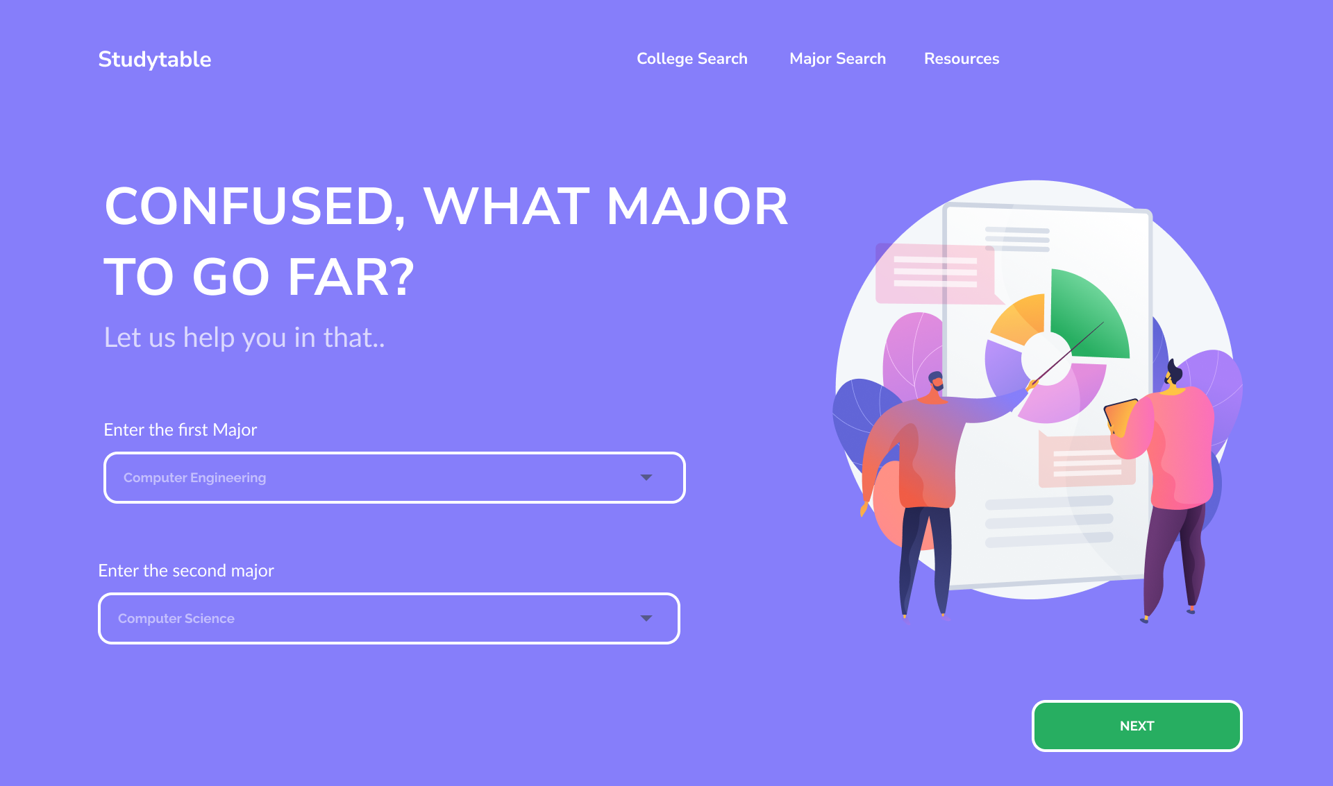
First time choosing a major
The student enters the courses they have taken and the grades they earned. Studytable reads the pattern and recommends majors that fit, then opens each one up: difficulty, careers, salaries, and aid.
Want to change my major
The student gives their current college and major, then their completed courses. Studytable shows what a switch really costs: which credits carry over, when they would graduate, and whether they would owe extra fees.
Splitting on intent up front meant neither student ever waded through steps meant for the other. Try it yourself in the prototype below.
Try the flow
The actual Studytable screens, made clickable. Pick a path and step through the flow, either choosing a major for the first time or working out what it costs to switch one.
The real screens
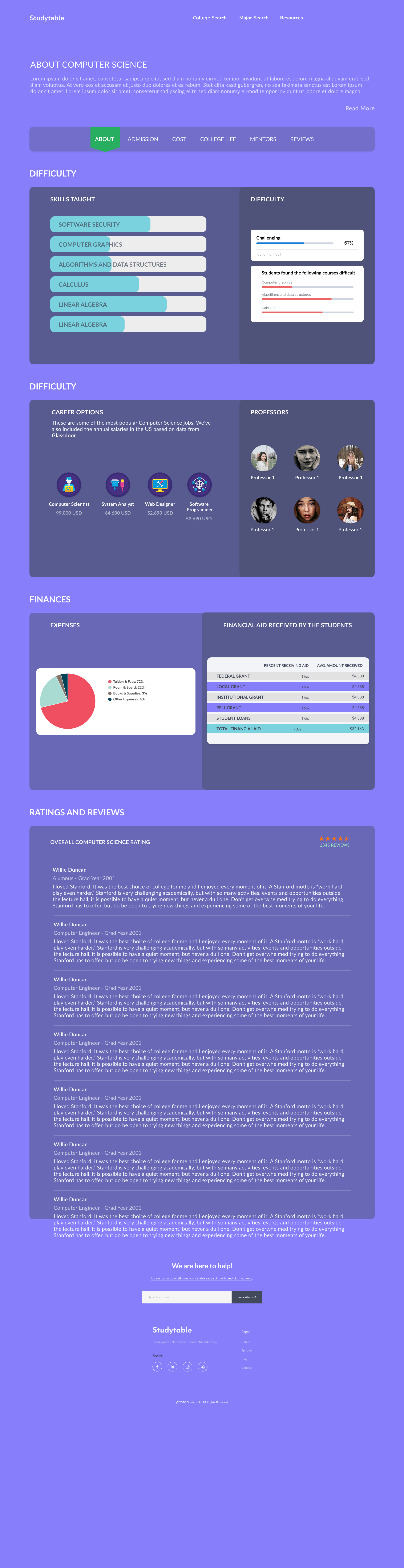
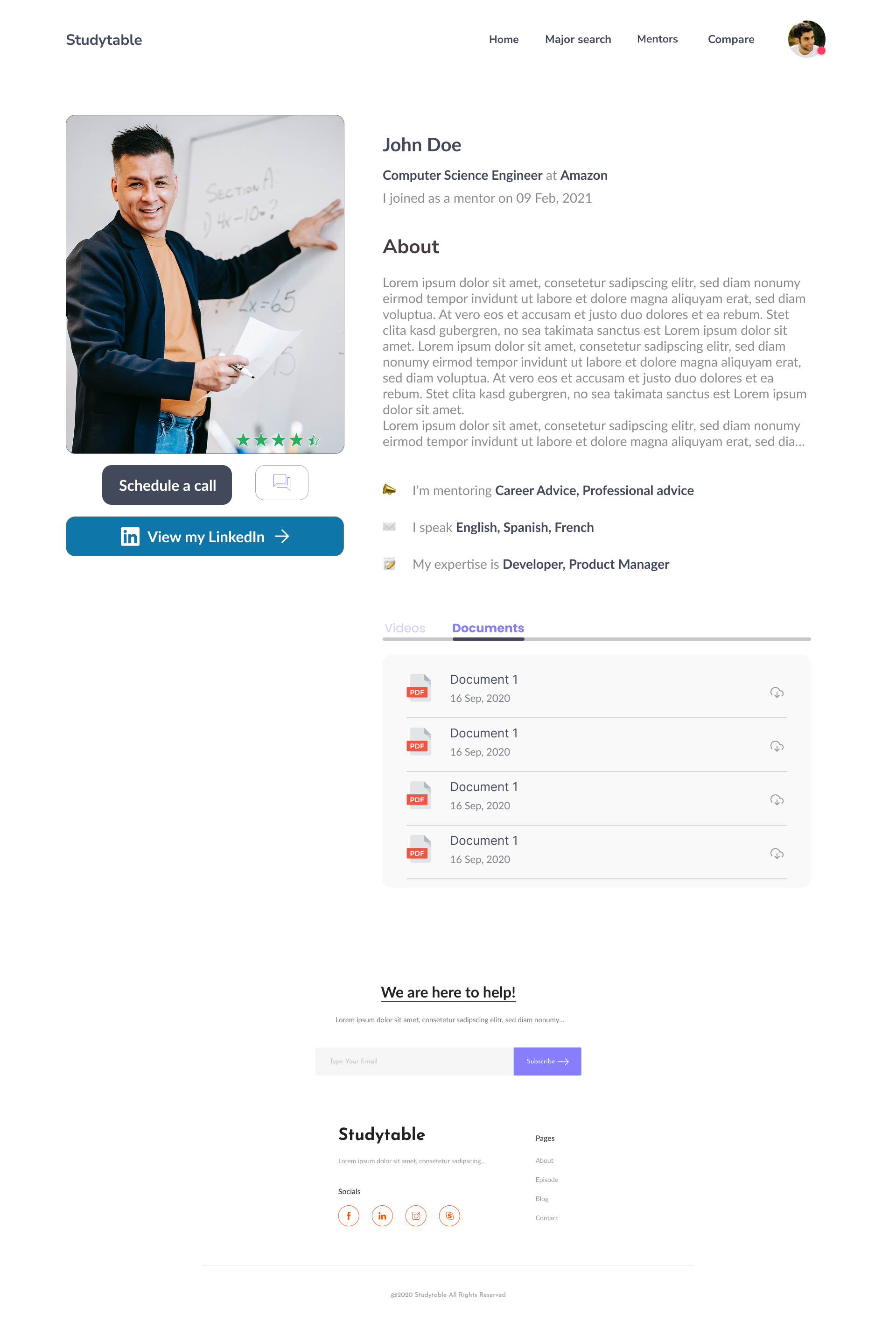
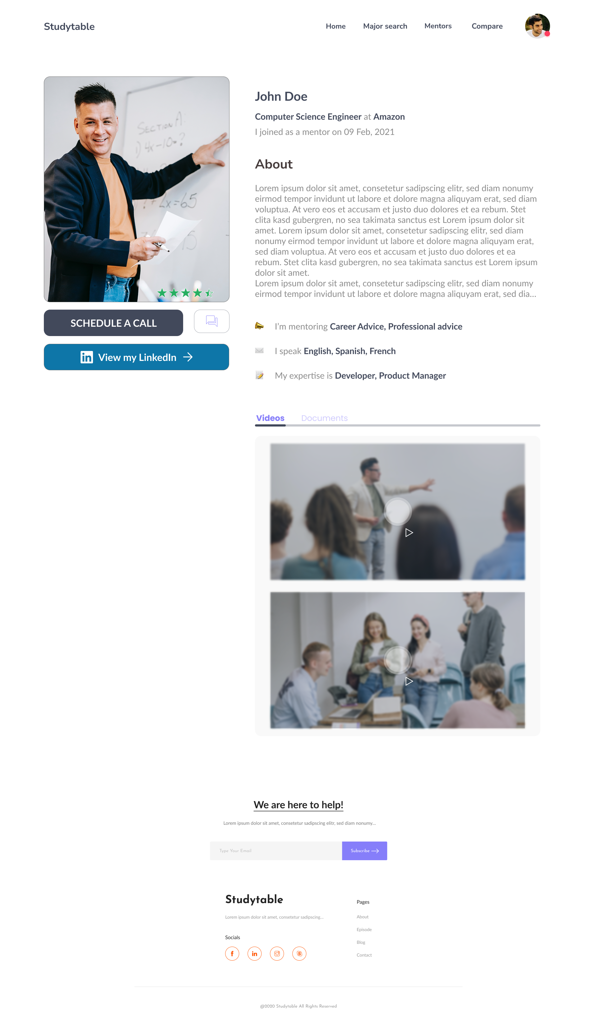
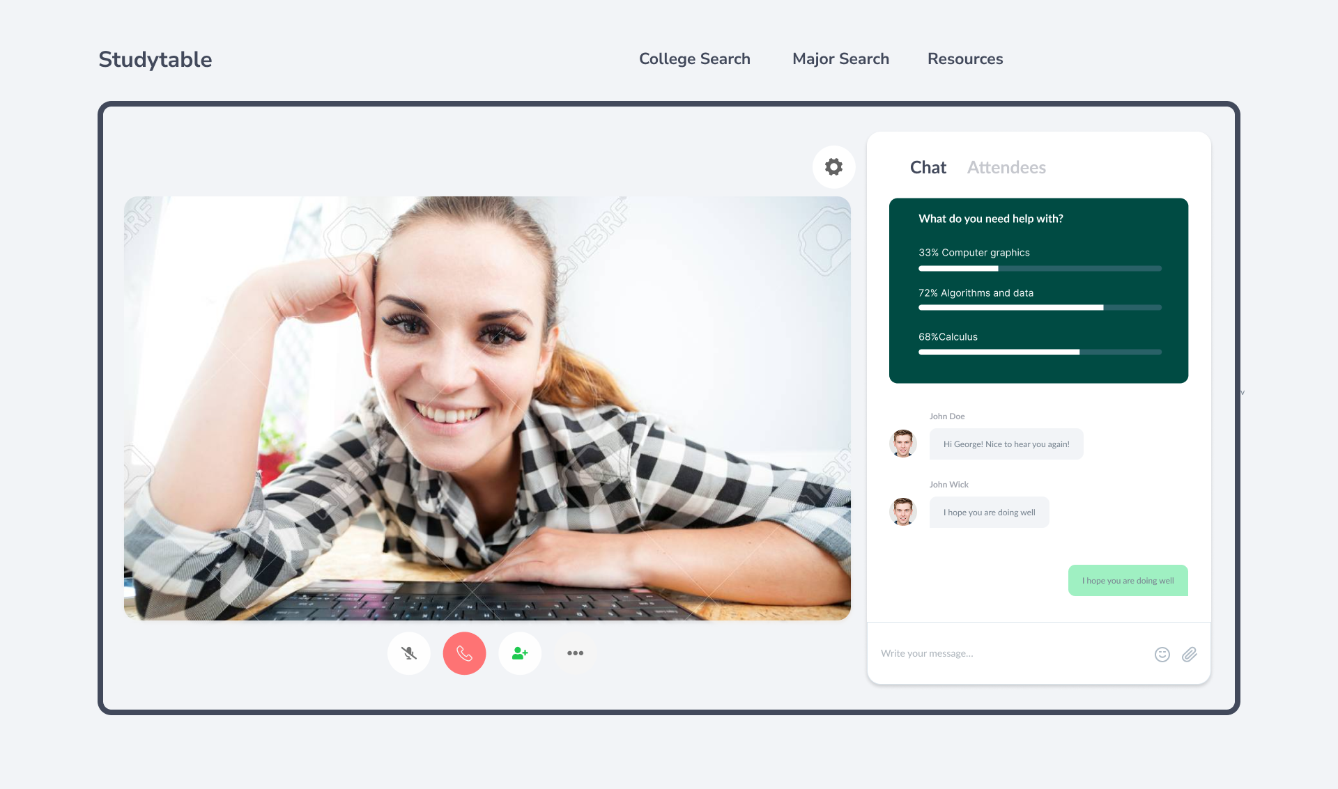
Beyond the search flow, Studytable had to feel like a real advisor. These are the actual capstone screens: a side-by-side comparison, the data behind each major, and mentors students could message, watch, and call.
What the capstone taught me
Branch on intent early
Asking "which one are you?" first kept two different students out of each other's way. One upfront question saved a dozen wrong-fit steps later.
Show cost, not just fit
The feature students reacted to most was the one that named the price of a decision: extra time, extra fees. Honesty about cost built more trust than any recommendation.
Data needs a human
Salaries and difficulty percentages only go so far. Pairing the numbers with mentors gave the whole thing the credibility a life decision deserves.
Studytable was where I learned to design around a decision, not a feature list. The interface is simple on purpose, because the thing it carries is not: a choice with years and money attached. If I built it again I would test the recommendation logic with real transcripts, since trust in the match is the entire product.